So, it all started here.
http://www.youtube.com/watch?v=iZDHfVitXLQ&feature=related
Well, actually, it started when Maria von Trapp sold her story to a German publisher for $9,000 and signed away all rights to it. Her story, which varied greatly from the eventual musical, was made into a film in Germany in 1956 which, in turn, was dubbed in English here in the United States. It was this film that caught Mary Martin's eye and that led her to bring the story to musical theater through the music of Rogers and Hamerstein. From that stage show, came what we now know as the Sound of Music. Interesting how similar this film seems to the mega-hit we know today.
Tuesday, September 7, 2010
Monday, September 6, 2010
my favorite things.

movie still from The Sound of Music, 1964

album cover from the RCA Victor original soundtrack of
The Sound of Music, 1964
I am about to reveal one of the biggest pet peeves of my childhood. Although it wasn't big to anyone else, it sheds light on the kinds of things that I spent my time thinking about and just exactly what kind of adult I would become. It has to do with this album cover and what I saw as the dishonesty of the graphic representation of the characters portrayed there.
The Sound of Music. I was obsessed with it. I listened to it repeatedly on the "Hi-Fi" in our downstairs family room. I portrayed the entire story in puppets (which was no easy matter when it came to the puppet show portion of the story...think puppets doing puppets...I only have two hands). I knew every single word by heart. I still do.
So, imagine the heartbreak I felt when I realized that the marketing department of RCA Victor had desecrated my beloved Maria, the Captain and those 7 dahhhling children for a sexier, more modern color palette on the original soundtrack album cover. Hello? Maria never wore a pink dress. The Captain would have never worn a khaki jacket with offset lapels, let alone contrasting trousers. And the children, oh, the children. Well, suffice it to say that those drapes from which their play clothes were made were not, I repeat, not a color that might have been called "Banan-appeal"...what was this, the Sound of Music Vegas Revue?
This was, however, my first introduction to creative license and the steps that companies will take to make things more attractive to the buying public - not that that musical needed it. I suppose that in 1964, when the film was made, it might have seemed too sentimental or traditional for some record buyers. I can just hear the discussion in the meeting right now:
First Record Executive: "So, let me get this straight. We're going to have this chick on the cover running up a hill with 7 children behind her?"
Graphic Artist: "uh...Yes, that's right."
Second Record Executive: "Hmmm...and you say she's holding a guitar?"
Graphic Artist: "Yes, in one hand and...um...and a carpet bag in the other."
First Record Executive: "A carpet bag? You've got to be kidding. A carpet bag and a guitar, isn't that a little 'folksy'? Where'd she come from, a nunnery? Is the chick at least a looker? I mean, does she have nice legs...anything we can work with, here?"
Graphic Artist: "Well, you don't really see her legs in the movie, so I don't know, but I suppose we could..."
Third Record Executive: "Nevermind about that for now. What about the guy? Where's the guy in the picture?"
Graphic Artist: "Well, he's sort of over off to the side...looking stern."
Second Record Executive: "Stern? People don't want stern. People want happy. This is really not good. um...What are they wearing?"
Graphic Artist: "Well, the girl is wearing a brown jumper, the man is wearing a grey Austrian suit with loden green lapels and the children...you're gonna love this...the children are wearing play clothes that the governess girl - you know the one with the guitar? - made out of green and white patterned drapes! Isn't that just too much?"
First Record Executive: "It's not too much...in fact, it's not enough."
Second Record Executive: "He's right...this is definitely NOT groovy enough for our time. People want something hip, something sexy. They don't want children dressed in upholstery."
Third Record Executive: "Okay...here's what we're going to do. Make the chick's dress bright pink and try to accentuate her curves. And raise the hem on her dress. Let's see a little leg."
First Record Executive: "I like it. And the guy...well, let's give him a bit of style, too. Something...I don't know...think 'Elvis'. But that still leaves the kids. What to do about the kids?"
Second Record Executive: "Well, the oldest is a beauty and has a great little figure. Let's put all of the other kids downhill from her, put her front and center with her arms back so we see...well, so that she's the one we see. And, PLEASE, don't use the patterned curtains on the clothes - even if that is how the costumer designed them. Let's change the color. Let's change it to...hmmm...I know - change it to the color of the sun...people are really diggin' the sun these days."
Graphic Artist: "But, excuse me...um...sirs...that's not the way the movie looks and this IS, afterall, the soundtrack for the movie, isn't it?"
First Record Executive: "Don't get wrapped up in the details, kid. People will never notice. Well, most people won't...unless you're some third grade girl in Texas who becomes obsessed with the movie...but how many of those could there be?"
[everybody laughs]
Saturday, September 4, 2010
enter.

 Mary Mikel Stump
post/lintel
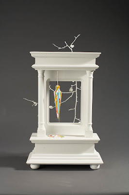
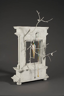
wood, gesso, graphite, acrylic paint, plumb-bob, string, branch, metal tubing

enter. (verb)
1. to go in.
2. to be admitted into a school, competition, etc.
3. to make a beginning.
4. to move upon the stage (as in stage directions.)
Well, there you have it. ENTER. The word itself implies moving through some sort of portal, be it real or metaphor. That one little word is my own personal battle cry for this, my 46th year on the earth. As an artist who practices in quasi-obscurity, it's hard to not seek solace in the saying, "...if you build it, they will come." Guess what? It just isn't so.
After subtle encouragement from the universe, I have promised myself that I would make efforts to show more often and respond to more Call for Entries. Whether the work is accepted or not is insignificant. This is about setting goals and carrying through. This is about doing the things that it will take to encourage myself to continue to grow as an artist. This is about looking at the work through a critical eye - either mine or the eye of the critic or curator who accepts or denies it. This, ultimately, is about what Robert Henri called The Art Spirit. Henri (1865 - 1929), who led the Ashcan School movement in art, and attracted a large, intensely personal group of followers, would not relate directly to his students while they were working; instead he would return to the classroom when it was empty, observe the various works of his students, and leave them notes to encourage and give direction to their work. Mostly these notes were poetic, metaphorical, oblique to the actual work. That is what we cannot give ourselves when we try to be our own critics. So instead, I have set forth on a course that I hope will give me small "notes" by which I can navigate my creative practice.
I decided to start by entering the work pictured here, post/lintel, which is by far the most formal of the body of work from which it comes. It refers to the most basic of structural relationships in architecture - and metaphorically, the most basic of human relationships in society. The post and lintel system is one in which two upright members, the posts, hold up a third member, the lintel, laid horizontally across their top surfaces. The lintel must bear loads that rest on it as well as its own load without deforming or breaking. It also refers to our ever changing relationship to the natural world, as we change our perceptions of nature by the ways in which we increasingly view it through our manipulation of the world, manifested in the built form. I could go on and on about what the work means - illuminating each little detail. I could talk about how the use of white obscures the detail of the built form and reduces it to a mere series of subtly changing values. I could talk about the colors selected and the way they layer upon each other on a basic tool of construction like the plumb-bob speaks to the thickening of our influence based on the next "trend in building." I could talk about the relationship between that plumb-bob that exists in the "interior" space of the work and it's physical connection to the "exterior" in the way it "pours" out the back of the sculptural structure. However, when it is all said and done, my descriptions, explanations and justifications matter not if those things are not apparent to the viewer.
And so it goes...my experiment to put myself...uh, I mean my work...out there to see what is resonant and what is not. It's an exciting practice.
I can't wait to see what comes of it.
Subscribe to:
Comments (Atom)

